Test Prep Tuesday: Know Your Quality Tools

Can you name the Project Management Quality charts? How about what you use them for?
Project managers juggle plenty of project data and for good reason: it’s potentially very useful in making decisions to implement continuous process improvement. What’s a project manager to do then? Visualize, of course. The below charts/diagrams are put to good use in Quality Project Management. You’ll need to know how use them for the PMP exam. So what’s what?
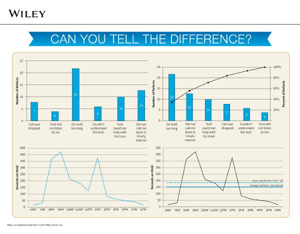
Row 1: Histogram, Pareto Diagram
A Histogram is a vertical bar chart arranged to show the shape of distribution of an event: for example, the shape of distribution of customer complaints coming in via social media. It can show the spread of results (dispersion) and the median (or mean or mode).
A Pareto Diagram is a vertical bar chart that creates a graphic display of events (such as causes of defects or types of defects) in descending order. The objective is to rank problems based on the frequency of occurrence to determine the order in which to resolve them.
Row 2: Run Chart, Control Chart
A Run Chart is used to identify trends in performance. Negative trends should be analyzed for corrective actions. A Run Chart can feed a Control Chart. Bonus tip: Run Chart is not technically one of the 7 basic quality tools. It feeds the control chart.
A Control Chart is used to determine whether a process is stable and predictable. The planned value of a process is the centerline. The upper and lower specification limits are the limits specified in the quality requirements.
Did you ace our quiz? Take a complete PMP exam to see if you’re really ready.